Watercolor Techniques
Beach Lighthouse
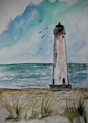
I like how the artist left some open space in certain areas of the painting. The use of cool colors make the painting look very interesting.
Lighthouse
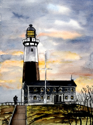
The contrast of the dark light house against the light sky makes the painting stand out more.
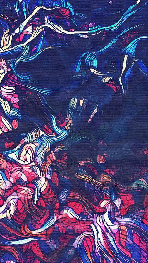
Curved Tree
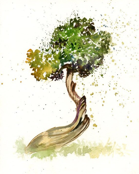
I love how this artist used a splatter like design around the tree. It also looks like he lightened some areas of the painting by using a kind of lifting technique.
Pair
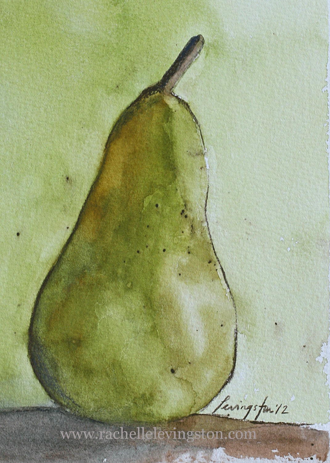
I love the shape of the pair. It looks as it is tilting a little to the side. The use of green to make the pair and the background is pretty.
Fruit Basket

This artist used complementary red and green to make most of the fruit in this artwork.
Self-portrait

I like the use of just one color in this painting. The red gives it a happier feel.
Beautiful Face

I love the different colors used in this painting, it makes it unique and beautiful.
Sad Dog

This artist used an interesting color to make the eyes. It provides the painting with a sense of sadness.
Fantastic Fox
I like how the artist went more detailed into the foxes hair color, the different shades and shadows make it look realistic.
Orange Sunset

This painting has a good balance. If cut down the middle, there would be about an even amount of detail and color on each side. It also used a lot of warm colors which helps bring out the sunset.
Cool Sunset
I love the different values of purple used in this painting. The yellowish color in the back is a little dull, but still works with the painting.
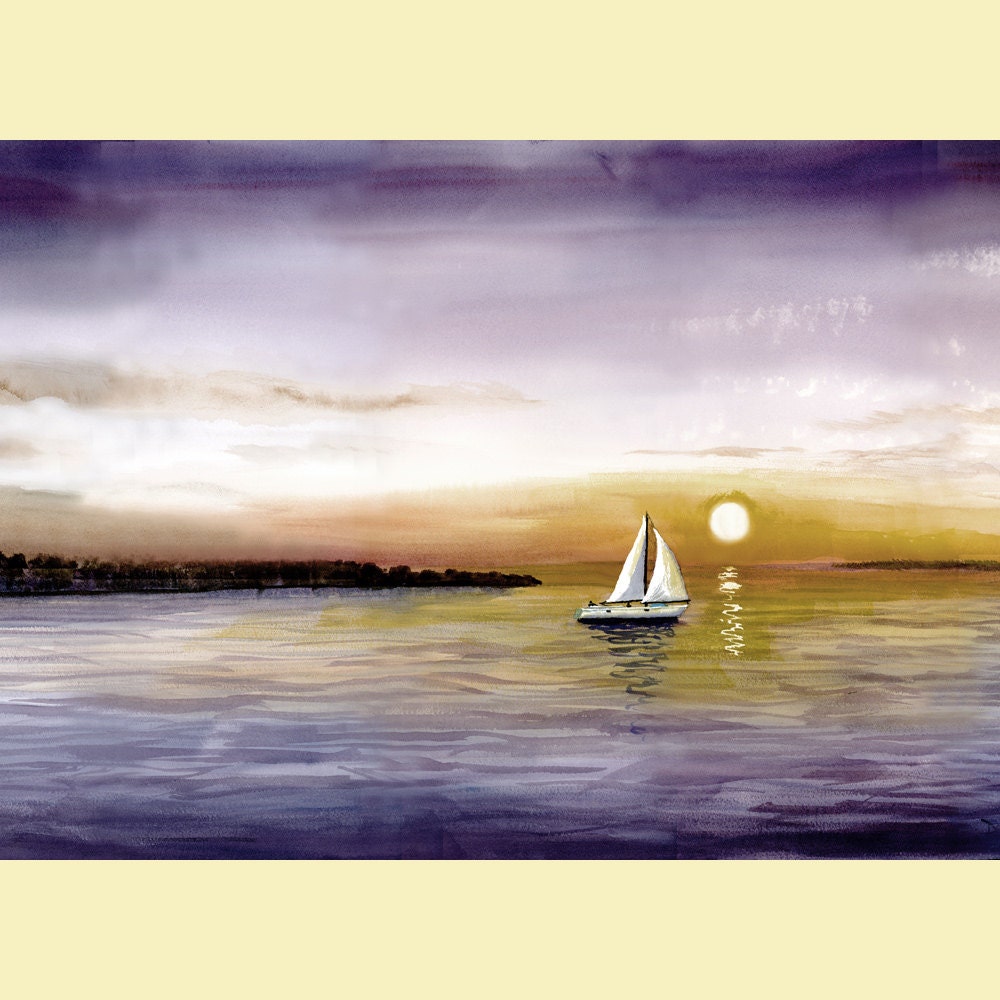
Sunset

The sun has a lot of emphasis making it the thing your eyes see first. I like the use of cooler colors to make the sunset.
Humming Bird

I love the use of splattering paint to make this hummingbird. It is very colorful and catches my attention.
Yellow Lab
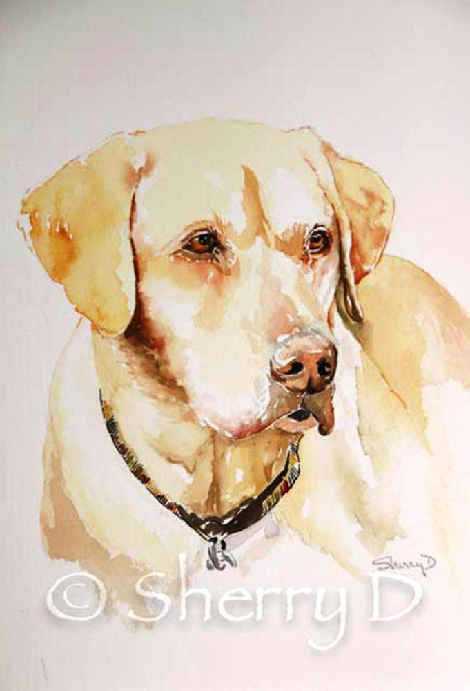
This is a really great painting of a yellow lab. The eyes look very complex and the design on the collar is fantastic.
Running Antelope

I like how the artist used all light colors for the background and a little darker colors to paint the antelope.
Creepy Forest

This painting uses darker colors to make a creepy kind of setting. The contrasting colors used in the rocks look good.
Converse

I love the colors used for the converse. The shadows show perfectly how the shoelaces fall and their twisted design.
Apples

The shadow in this painting is proportional to the apples making it seem more life-like. The colors of the apples look pretty realistic.
By the Sea

I love the colors used in the sunset behind the building. It stands out against the darker colors used in the rest of the painting.
Fishing Village

This painting uses cool colors giving it a type of mysterious feel. I like the different shades of blue and green used to create this piece.
